Helping others (and myself) explore the world easily with Chronacle

Until 2023, I had never owned a passport; I still have never even been on an airplane despite having many places I'd like to visit.

For a few years, I used a spreadsheet in Notion to list destinations, sights, and interesting restaurants, but eventually, I decided I wanted a better way to plan my future trips; I imagined others might have as well, given the boom in travel following the COVID-19 pandemic.
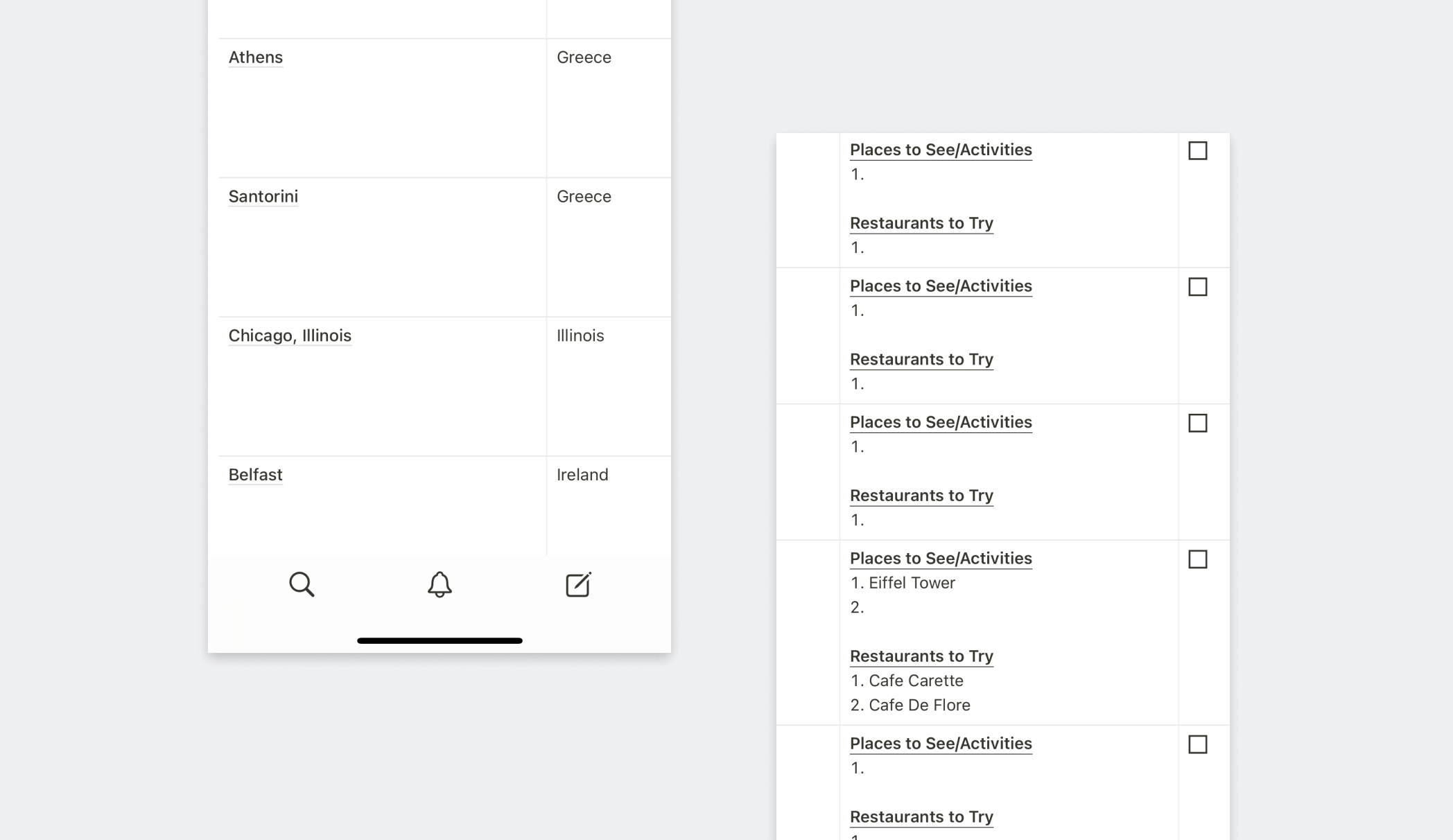
Two screenshot panels placed side by side. The left panels shows a list of cities and the county or U.S. state they are located in. The first panel shows another side of the spreadsheet, which includes a list of places to see and restaurants to try for each city.
Example of trip planning in Notion.

I saw that as an opportunity to grow and reinforce my design skills by creating a tool for myself and others to use. It is named Chronacle since it is meant to help you chronicle your journeys around the world.
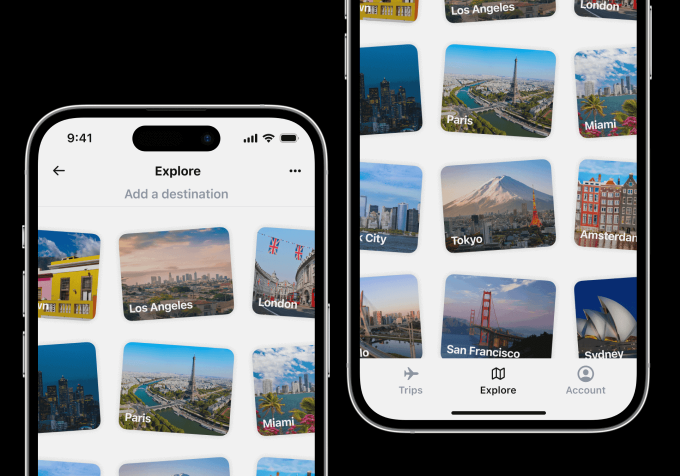
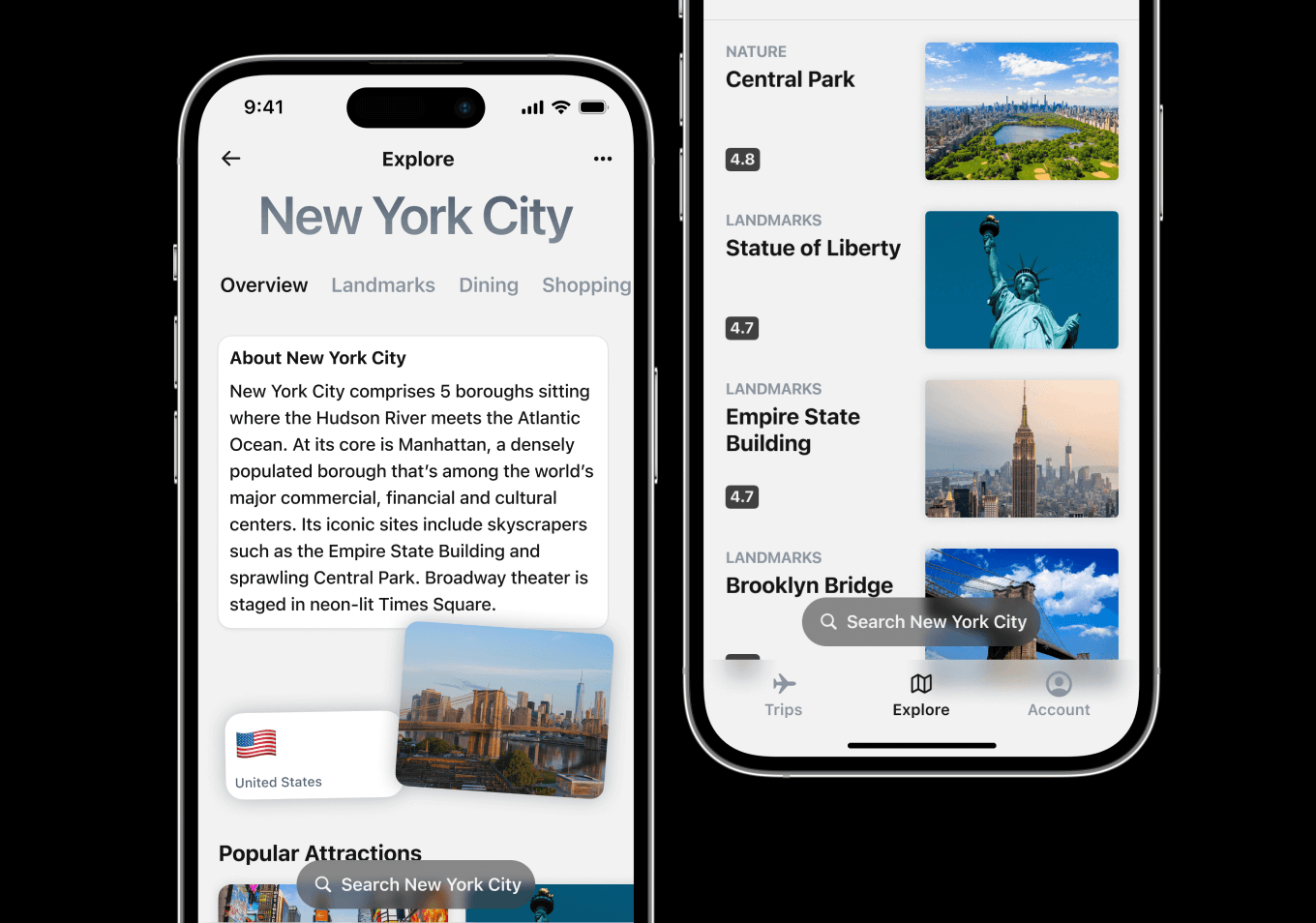
Photo of the Explore screen in Chronacle. In its empty state, there is a grid of tilted photos of different cities. Each photo has a hero image of the respective city and its name at the bottom. There is a header bar at the top that says Explore, and says 'Add a destination' in grey underneath it.
The Explore screen in Chronacle.
Two iPhone screens side by side, the first of which says New York City and provides an overview of New York alongside a small photo of the skyline. The second screen has a list of New York landmarks, each with a photo and rating out of 5.
The Overview screen for New York City.

Research

As the sole designer for Chronacle, I needed to be crafty when doing needfinding and figuring out which problems needed addressing or which parts of the travel planning process could be improved; in addition to doing heuristic analyses on existing travel aggregators (Expedia, TripAdvisor, etc), a large part of my generative research involved leveraging data from a 2021 study by market research leader Mintel.

Of the 1,300+ travelers surveyed, people overwhelmingly reported booking reservations through their preferred brands' platforms, with 76% using a brand's website or mobile app (ex: Marriott Hotels) vs. an aggregator. The study mentions travel aggregators are “most competitive in activities booking,” not accommodations.

Mintel also discovered folks are taking fewer, shorter trips post-pandemic, only traveling to familiar places, and booking accommodations mere days / weeks before leaving. Travelers need helpful starting points when going somewhere new and want ideas for things to do.
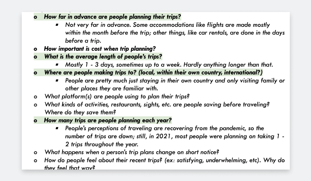
Screenshot of my research document. This part of the document includes a list of research questions I wanted to answer during my generative research phase of designing Chronacle. Some questions are highlighted to indicate priority, such as, 'How far in advance are people planning their trips?,' 'What is the average length of people's trips?,' 'Where are people making trips to?,' and 'How many trips are people planning each year?.'
Some questions I wanted to answer during my generative research.

Designs

As such, I decided Chronacle would not handle things like flight reservations, hotel accommodations, car rentals, etc. The reduced scope is better for engineering purposes (no need to integrate various airline/hotel platforms), but users also get a more focused and predictable experience with fewer potential failure points.

Ultimately, the main focus for Chronacle would just be helping people check out new places they're interested in visiting and save activities / experiences they want to make plans for (ex: shopping, places in nature, landmarks, etc).
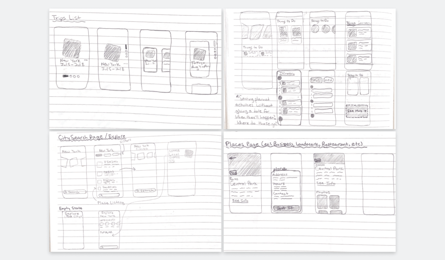
Collection of sketches I completed when ideating on the user experience for Chronacle. There are 4 panels. The top left panel shows my ideas for a user's trips list. The top right shows sketches for the interface when inside of a trip's page. The bottom left shows the interface when the user is searching businesses in a city, and the bottom right shows what it looks like when a user clicks on a business or activity.
Some ideation sketches.
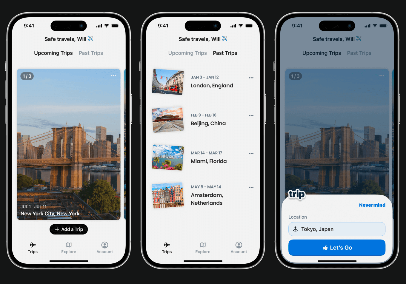
Three iPhone mockups. The first shows an example of a location card, which has a photo and the trip dates. The second shows a list of small location cards representing the user's previous trips. The third shows New Trip modal, and the user has Tokyo, Japan in the search field.
Example of a user's Trips List.
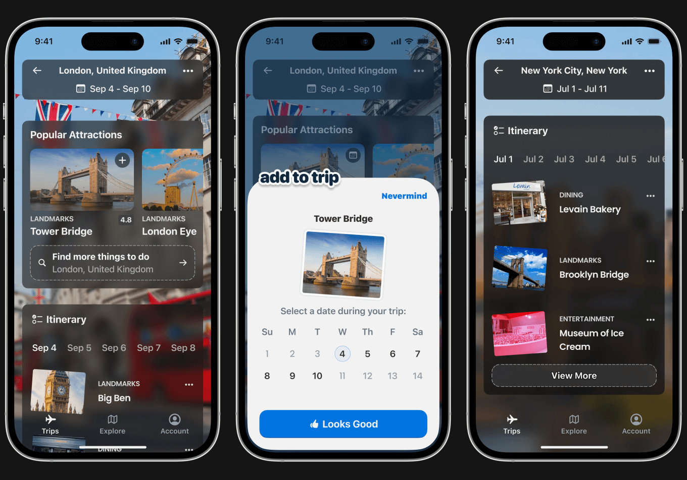
Three iPhone mockups. The first shows an example of a Trip Page; each page has the location, the trip dates, popular attractions, and the user's itinerary. The second mockup shows an Add to Trip modal for activities, which includes a small photo of the place being added and selectable trip dates. The third mockup shows an itinerary, which has a list of places for each selectable date.
The UI of a specific Trip page.
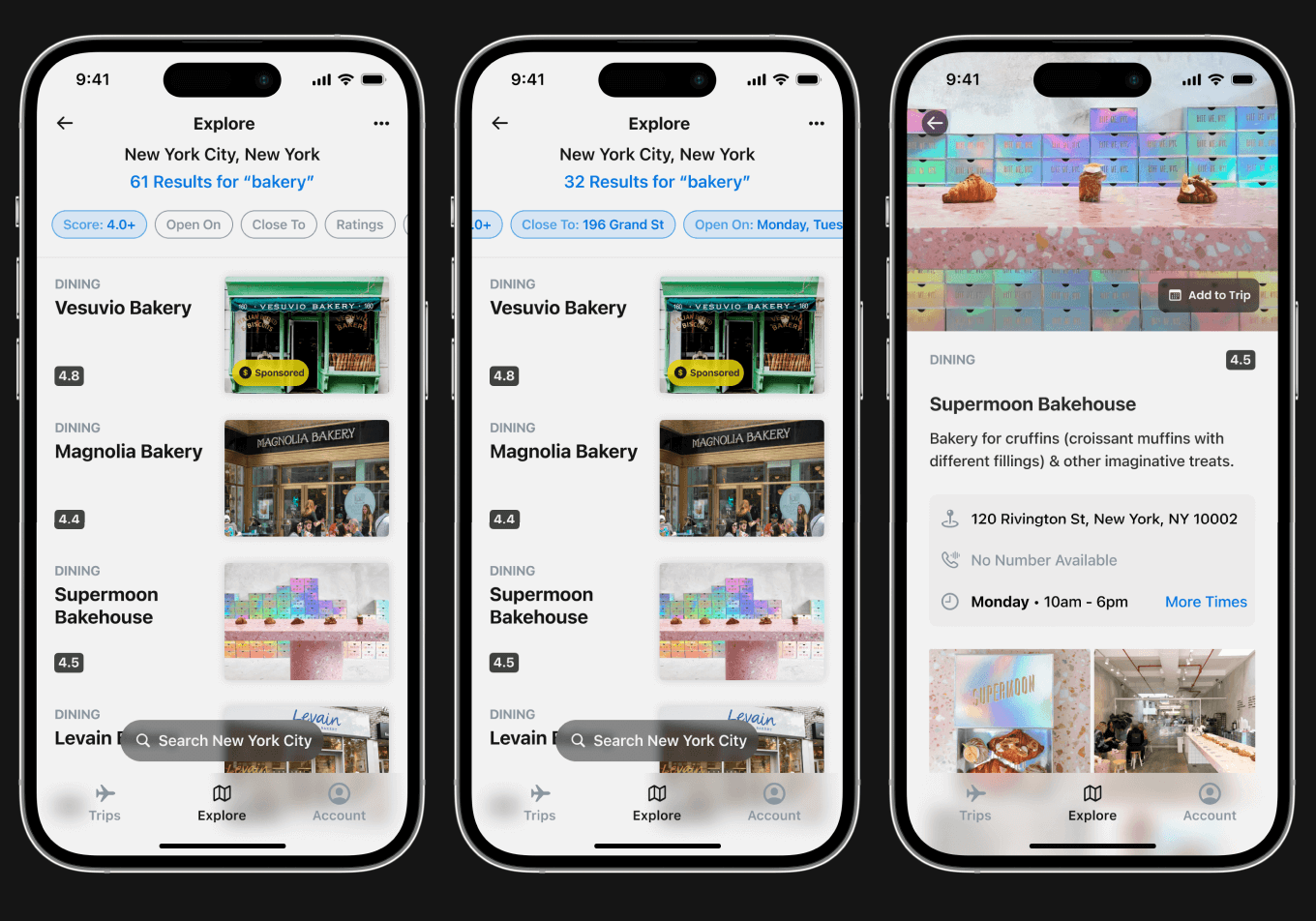
Three iPhone mockups. The first and second mockups show the Search page for places in a given location; the results include a list of places users can select to learn more about, and multiple filters for refinement. The last mockup is an example of a specific establishment's info page; the page includes a description, address, contact info, and photos.
Example of the Place Search screens/flow for New York City.