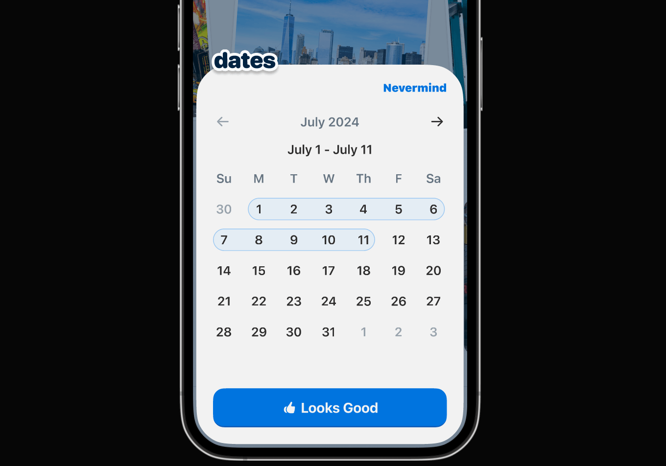
Developing Chronacle
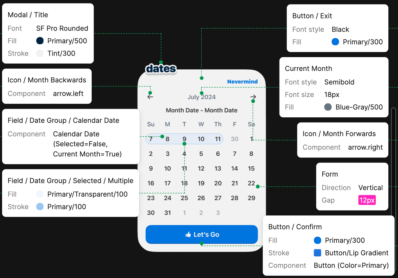
Chronacle's design system is being maintained in Figma, allowing me to keep future designs consistent by using things like design tokens, as well as make development flows simple and seamless.
My design decisions are informed by my understanding of modern web's possibilities and limitations. I wanted to make my development process as streamlined as possible, so I thought a lot about tools that would help make that happen. In terms of front-end specifically, some tools I'm using are:
- Next.js: I decided on Next.js as my framework since it supports a variety of useful front-end tech natively (Typescript/TSX, Postcss, CSS Modules, Web Vitals, etc).
- Style Dictionary: I'm using Style Dictionary to incorporate design tokens into my development flow; this helps keep design decisions consistent across all environments and reduces development time.
- CSS Modules: CSS Modules help me easily import CSS styling for multiple components and layouts without namespace collisions.
- Class Variance Authority: CVA lets me define variants of each component and generate class names based on which variant is invoked. Generated class names match those imported from the CSS module for any respective component.
- Storybook: While static components are being maintained in Figma, I also build out each one and store them in Storybook. This helps make development much easier since I can modify components as needed and see how they interact with each other before publishing.
                        modules.exports = {


                        source: ['src/tokens/**/*.tokens.json'],


                        platforms: {


                        scss: {


                        transforms: ['attribute/cti', 'name/ti/camel'],


                        transformGroup: 'scss',


                        buildPath: 'src/styles/scss/',


                        files: tokenFileGenerator.baseTokens.map((tokenCategory)
                        => ({


                        destination: `_${tokenCategory}.module.scss`,


                        format: 'scss/variables',


                        filter: tokenFilter(`${tokenCategory}`),

                    })),
                    },
                    },
                    };
                    {

                        "color": {


                        "blue-100": {


                        "value": "#99C7F2",


                        "category": "color"


                        // becomes $blue100 in _color.module.scss

                    },
                    },
                    }
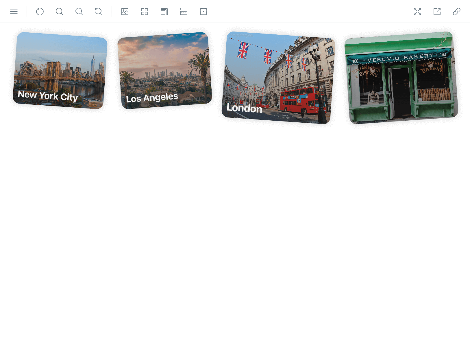
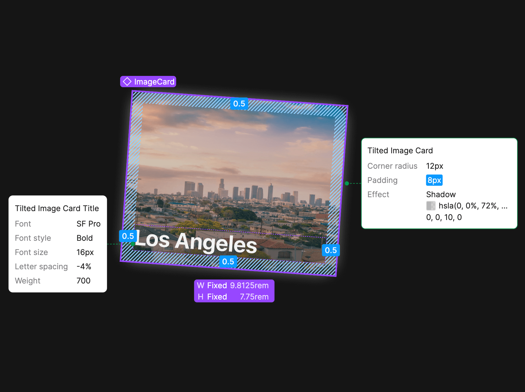
Here's an example of my workflow using my Tilted Image Card component:
                    .TiltedImageCard {

                    @include
                    main.flex-column;


                    justify-content:

                    flex-end;


                    align-items:
                    flex-start;


                    overflow:
                    hidden;


                    border-radius:
                    1.2rem;


                    box-shadow:
                    0px 0px 10px 0px
                        rgba(184, 184, 184, 0.64);

                    }

                    .small {

                    width:
                    9.8125rem;


                    max-width:
                    9.8125rem;


                    height:
                    7.75rem;

                    }

                    .small > .cardTitle {

                    font-size:

                    typography.$fontSize16;

                    }

                    .large {

                    width:
                    11.775rem;


                    max-width:
                    11.775rem;


                    height:
                    9.3rem;

                    }

                    .large > .cardTitle {

                    font-size:

                    typography.$fontSize18;

                    }

                    .cardTitle {

                    font-family:
                    typography.$fontFamilyMain;


                    font-weight:
                    typography.$fontWeightBold;


                    letter-spacing:
                    typography.$letterSpacingRegular;


                    color:
                    $white300;


                    padding:
                    1.2rem;


                    position:
                    absolute;


                    line-height:
                    normal;


                    align-self:
                    stretch;

                    }
                    import
                    styles
                    from
                    './TiltedImageCard.module.scss';


                        // Using Class Variance Authority to declare


                        // component variants and their associated class names:


                        const tiltedImageClasses =
                        cva(styles.TiltedImageCard,
                        {


                        // Class names for this variant will


                        // include ".TiltedImageCard .small"


                        variants: {


                        size:{


                        small:
                        styles.small,


                        large:
                        styles.large,

                    },


                        tiltDirection: {


                        left:
                        styles.leftTilted,


                        right:
                        styles.rightTilted,

                    },

                    },

                        defaultVariants: {


                        size: 'small',

                    },

                        });


                        // Defining my variant categories as component


                        // props, along with the props 'title' and 'mediaSource':


                        interface TiltedImageCardProps
                        extends
                        VariantProps<typeof
                        tiltedImageClasses> {


                        title?: String;


                        mediaSource: StaticImageData;

                    }


                        // The component with props being passed in:


                        export default function TiltedImageCard({


                        size,


                        tiltDirection,


                        title,


                        mediaSource,


                    }: TiltedImageCardProps) {


                        return (


                        <article className={tiltedImageClasses({
                            tiltDirection, size
                        })}>


                        <div className={styles.cardGradient}></div>


                        <img className={styles.cardMedia}
                        src={mediaSource.src}></img>


                        <p className={styles.cardTitle}>{title}</p>


                        </article>


                        );

                    }
                    export const
                    TiltedImages:
                    Story = {


                        render: () => (


                        <TiltedImageCard


                        tiltDirection={'right'}


                        title={'New York City'}


                        mediaSource={photoNewYork}


                        </TiltedImageCard>


                        <TiltedImageCard


                        tiltDirection={'left'}


                        title={'Los Angeles'}


                        mediaSource={photoLosAngeles}


                        </TiltedImageCard>


                        <TiltedImageCard


                        tiltDirection={'right'}


                        title={'London'}


                        mediaSource={photoLondon}


                        </TiltedImageCard>


                        <TiltedImageCard


                        tiltDirection={'left'}


                        mediaSource={photoVesuvio}


                        </TiltedImageCard>


                        ),


                        args: {},

                    };
...and all of that ultimately becomes 🪄